
Climate Matters•September 18, 2024•Reuse this content
Risky Summer Heat Added by Climate Change

KEY CONCEPTS
June-August 2024 was Earth’s hottest season on record — during which climate change boosted risky heat for billions across the globe, according to new Climate Central analysis.
From June-August 2024, 2 billion people (25% of the global population) experienced 30 or more risky heat days that were made at least three times more likely by climate change.
Carbon pollution also drove risky summer heat in the U.S. Risky heat days are hotter than 90% of those recorded in a local area from 1991-2020.
The average person in the U.S. experienced 20 extra days of risky heat because of climate change from June-August 2024.
Over 91 million people in the U.S. (27% of the population) experienced 30 or more risky heat days that were made at least two times more likely by climate change.
States and cities in the Southwest, Southeast, and South experienced the most risky heat days added by climate change this summer.
From June-August 2024, 26 U.S. cities had at least one dangerous extreme heat wave (at least five consecutive days hotter than 99% of temperatures recorded in that city from 1991-2020).
Across these 26 cities, extreme heat waves of this intensity and duration are, on average, 14 times more likely today because of human-caused climate change.
Extreme heat: a health risk boosted by climate change
Extreme heat is a growing health risk in our warming climate. In 2023, a record 2,325 people died from heat in the U.S. alone.
Globally, June through August 2024 was Earth’s hottest season on record — during which the planet had its single hottest day on record (July 22, 2024).
During this period (June - August 2024), human-caused climate change increased heat-related health risks for billions, and made heat extreme events longer and more likely around the globe, according to new analysis using Climate Central’s Climate Shift Index (CSI).
A CSI level 2 (3, 4, etc.) indicates local temperatures that were made at least two (three, four, etc.) times more likely due to climate change.
Learn more about the CSI: explore the map tool, watch a video explainer, or read the FAQs.
Global influence of climate change during the last three months
According to Climate Central’s latest report, People Exposed to Climate Change: June-August 2024, carbon pollution, primarily from burning fossil fuels, drove extreme heat across the globe from June to August 2024.
At least one in every four people on the planet experienced temperatures made at least three times more likely because of climate change on every single day from June through August.
Global exposure peaked on August 13, 2024, when 4.1 billion people — 50% of the global population — experienced temperatures very strongly influenced by climate change (CSI level 3 or higher).
During the last three months, the average person on the planet experienced 17 extra days of risky heat because of climate change. Risky heat days are days with temperatures hotter than 90% of the temperatures recorded in a local area from 1991-2020. Heat-related health risks rise when temperatures climb above this local threshold.
Over 2 billion people (25% of the global population) experienced 30 or more days of risky heat that were made at least three times more likely by climate change. This included nearly the entire population of the Caribbean and at least three in every four people in: Western Asia, Micronesia, Northern Africa, and Southern Europe.
For more global analysis: read the report or explore the data for 218 countries and 941 cities.
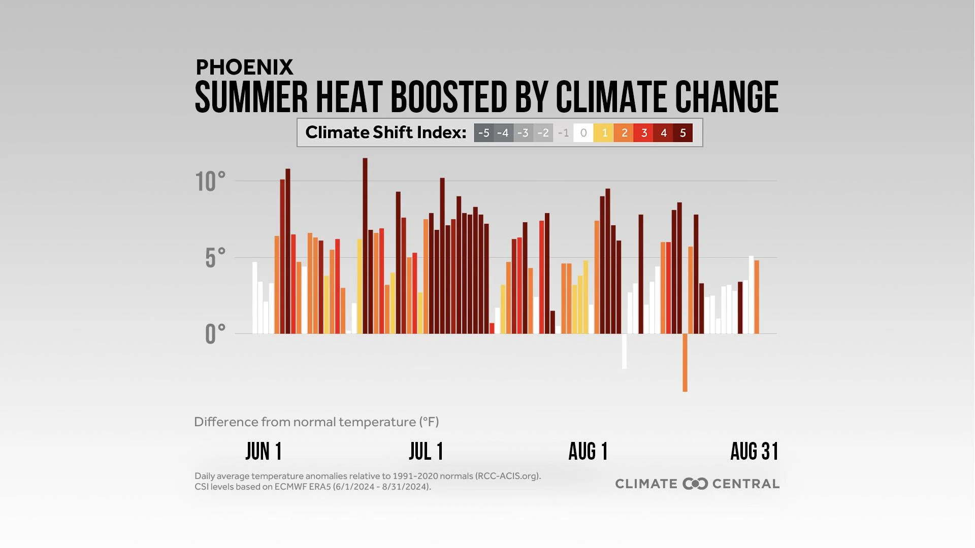
Influence of climate change in the U.S. this summer
This new global analysis also used the CSI to quantify the influence of human-caused climate change on daily average temperatures in 240 U.S. cities from June-August 2024. See Methodology for details.
Across the U.S., 333 million people — 99% of the U.S. population — experienced at least one summer day with a CSI level 2 or higher — indicating hot average temperatures made at least two times more likely by climate change (CSI level 2 or higher).
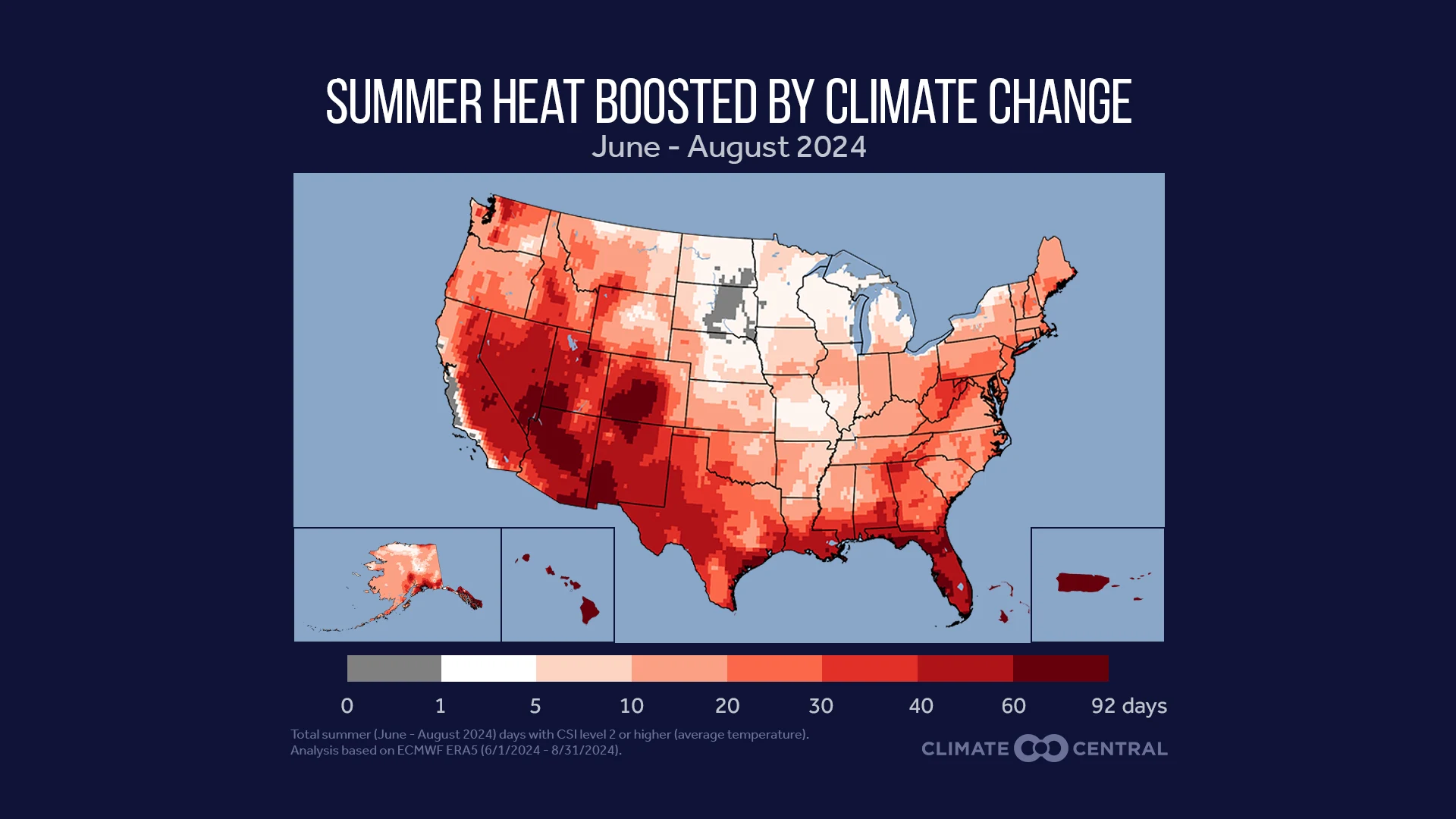
The average person in the U.S. experienced 24 days — more than one-quarter of the entire season — with unusually hot temperatures made at least two times more likely by climate change.
More risky summer heat in the U.S. due to climate change
This analysis also used the CSI system to calculate the number of risky heat days people experienced this summer, compared to the number that would have occurred without human-caused climate change.
Risky heat days are days with temperatures hotter than 90% of the temperatures recorded in a local area from 1991-2020. Heat-related health risks rise when temperatures climb above this local threshold.
See: More Risky Heat Days in 232 U.S. Locations for details.
According to this analysis, the average person in the U.S. experienced 20 extra days of risky heat because of climate change from June-August 2024.
Over 91 million people in the U.S. (27% of the population) experienced 30 or more days of risky heat that were made at least two times more likely by climate change.
Population exposed to risky heat with CSI level 2 or higher | Percent of total U.S. population | |
|---|---|---|
1+ day | 332,915,000 | 99% |
7+ days | 285,521,000 | 85% |
30+ days | 91,583,000 | 27% |
61+ days | 2,775,000 | 1% |
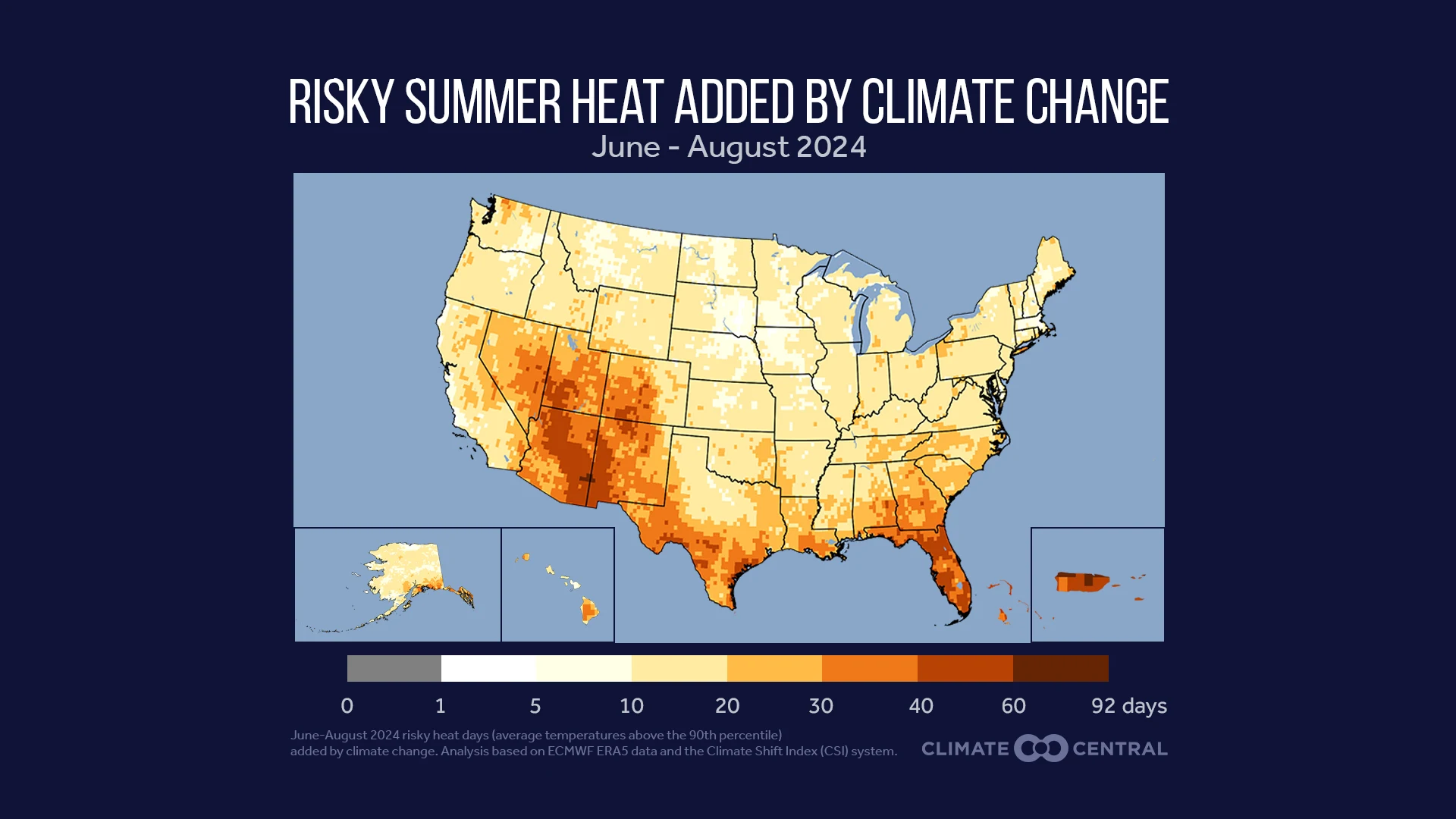
States and cities with the most risky heat days added by climate change
The U.S. states and cities that experienced the most risky heat days added by climate change this summer were concentrated in the Southwest, Southeast, and South.
The average person in Florida experienced 41 additional days of risky summer heat due to human-caused climate change. That’s 45% of the 92 total days in the summer season.
State | Per-capita average risky heat days added by climate change | City | Per-capita average risky heat days added by climate change |
|---|---|---|---|
Florida | 41 | San Juan, P.R. | 64 |
Arizona | 32 | West Palm Beach, Fla. | 50 |
New Mexico | 32 | Corpus Christi, Texas | 47 |
Utah | 30 | Gainesville, Fla. | 47 |
Texas | 27 | Prescott, Ariz. | 47 |
Louisiana | 26 | Sarasota, Fla. | 47 |
Georgia | 26 | Tampa, Fla. | 47 |
Nevada | 25 | Flagstaff, Ariz. | 45 |
South Carolina | 24 | Fort Myers, Fla. | 44 |
Alabama, Colorado | 23 | Victoria, Texas | 43 |
At a more local level, five of the top 10 U.S. cities were in Florida. The average resident across these five Florida cities experienced between 44 (Fort Myers) and 50 (West Palm Beach) additional days of risky heat due to climate change.
San Juan, Puerto Rico topped the cities list with 64 extra risky heat days due to climate change, accounting for 70% of the summer season.
Dangerous extreme heat waves boosted by climate change
From June through August 2024, 26 U.S. cities had at least one dangerous extreme heat wave. In this analysis, a dangerous extreme heat wave is defined as at least five consecutive days that were hotter than 99% of temperatures in that city from 1991-2020.
These 26 cities were primarily located in the South (10) and West (6).
Extreme heat waves of the intensity and duration experienced in these 26 cities are, on average, 14 times more likely in today’s climate than they would otherwise be in a world without human-caused climate change.
City | Longest dangerous extreme heat wave (days) | Temperature anomaly during longest dangerous extreme heat wave (°F) | Multi-day CSI during longest dangerous heat wave (times more likely in today’s climate) |
|---|---|---|---|
Las Vegas, Nev. | 11 | 9.6° | 29 |
Mobile, Ala. | 11 | 5.2° | 13 |
Reno, Nev. | 11 | 10.7° | 17 |
Palm Springs, Calif. | 11 | 8.9° | 10 |
Abilene, Texas | 10 | 9.8° | 13 |
Missoula, Mont. | 10 | 11.2° | 5 |
Denver, Colo. | 9 | 8.0° | 16 |
San Juan, P.R. | 8 | 3.3° | 40 |
Tucson, Ariz. | 8 | 6.5° | 17 |
LOCAL STORY ANGLES
CSI tools, data, custom maps, and local alerts
Here are four ways to use this attribution analysis from Climate Central:
Use the tools. Climate Central’s Climate Shift Index map tool shows which parts of the world are experiencing high CSI levels, every day. Explore the global CSI map for today, tomorrow, and any day from June through August.
Download the data. Data from this analysis are available to download and explore in more detail the daily global population exposure to high CSI levels, and summary conditions for 202 countries and territories for June through August 2024.
Create custom CSI maps. The Climate Shift Index is now available in KML format. Fill out this form to join our pilot project, receive the KML links, and create custom CSI maps.
Sign up for alerts. Sign up here to receive custom email alerts when strong CSI levels are detected in your local area.
Quick facts on the links between climate change and extreme heat:
Climate Central’s Extreme Weather Toolkit: Extreme Heat
World Weather Attribution’s Reporting Guide for Journalists
CONTACT EXPERTS
To request an interview with a Climate Central scientist, please contact Peter Girard at pgirard@climatecentral.org.
FIND EXPERTS
Submit a request to SciLine from the American Association for the Advancement of Science or to the Climate Data Concierge from Columbia University. These free services rapidly connect journalists to relevant scientific experts.
Browse maps of climate experts and services at regional NOAA, USDA, and Department of the Interior offices.
Explore databases such as 500 Women Scientists, BIPOC Climate and Energy Justice PhDs, and Diverse Sources to find and amplify diverse expert voices.
Reach out to your State Climate Office or the nearest Land-Grant University to connect with scientists, educators, and extension staff in your local area.
METHODOLOGY
Daily average temperature anomalies (relative to 1991-2020 normals) were obtained from the Applied Climate Information System (ACIS) for 240 U.S. weather stations from June 1, 2024 to August 31, 2024. While Climate Matters local analyses typically include data from 247 stations, seven were excluded from this analysis due to insufficient data: Bend, Ore.; Glendive, Mont.; Hattiesburg, Miss.; Idaho Falls, Idaho; Lafayette, Ind.; Laredo, Texas; and Panama City, Fla.
All Climate Shift Index (CSI) levels reported in this brief are based on daily average temperatures from June 1, 2023 to August 31, 2024. See the frequently asked questions for details on computing the Climate Shift Index, including a summary of the multi-model approach described in Gilford et al. (2022). For detailed methodology behind the global analysis, see: People Exposed to Climate Change: June-August 2024.
Risky heat days reflect the local minimum mortality temperature, which was approximated in this analysis as the 90th percentile average daily temperature over the last normal period (1991-2020). Tobías et al. (2021) estimated local MMT in 683 global locations using local temperature and mortality data, and calculated the MMT percentile (MMTP) for each location, defined as “the percentile of the temperature distribution corresponding to the MMT." Of the 211 U.S. locations analyzed by Tobías et al. (2021), 95% had a MMTP that corresponds to the 90th temperature percentile. This is broadly consistent with Gasparrini et al. (2015), who estimated local minimum mortality percentiles (MMP) for 135 U.S. cities, and found that the median MMP across these 135 cities was the 84th percentile. For more details on MMT and related health risks, see: More Risky Heat Days in 232 U.S. Locations.
Climate Matters © 2024 by Climate Central is licensed under CC BY 4.0
This license grants permission to use, distribute, and reproduce all text, graphics, and multimedia content published on this page in any medium, provided that Climate Central is credited per the CC BY 4.0 license.
Permission to use data and other materials published on this page is granted for non-commercial uses, commercial news purposes, and educational purposes as governed by Climate Central's Terms of Use.